
DELLI 1.5 to 2.0
Enhancing the existing DELLI UI and creating the future app experience for DELLI customers
Highlights:
Established the DELLI Design System
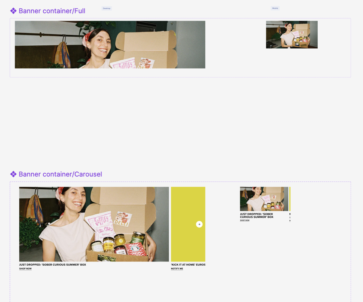
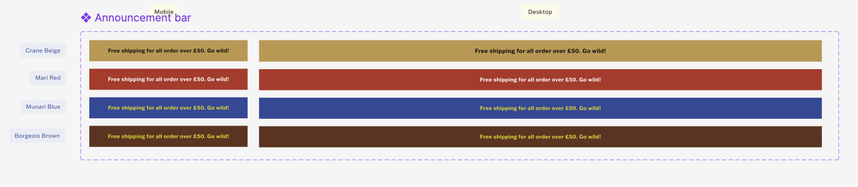
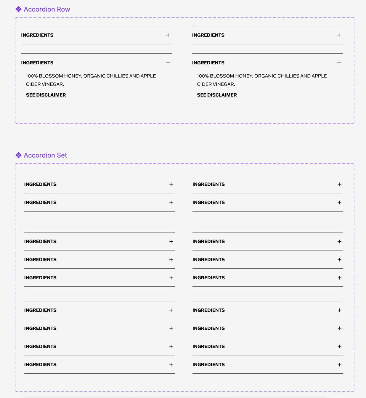
New Shopify component library designed and deployed
Increased page engagement by nearly double in 2 months
4 DELLI 2.0 prototypes created
12 user interviews conducted for DELLI 2.0 planning
The DELLI Design System
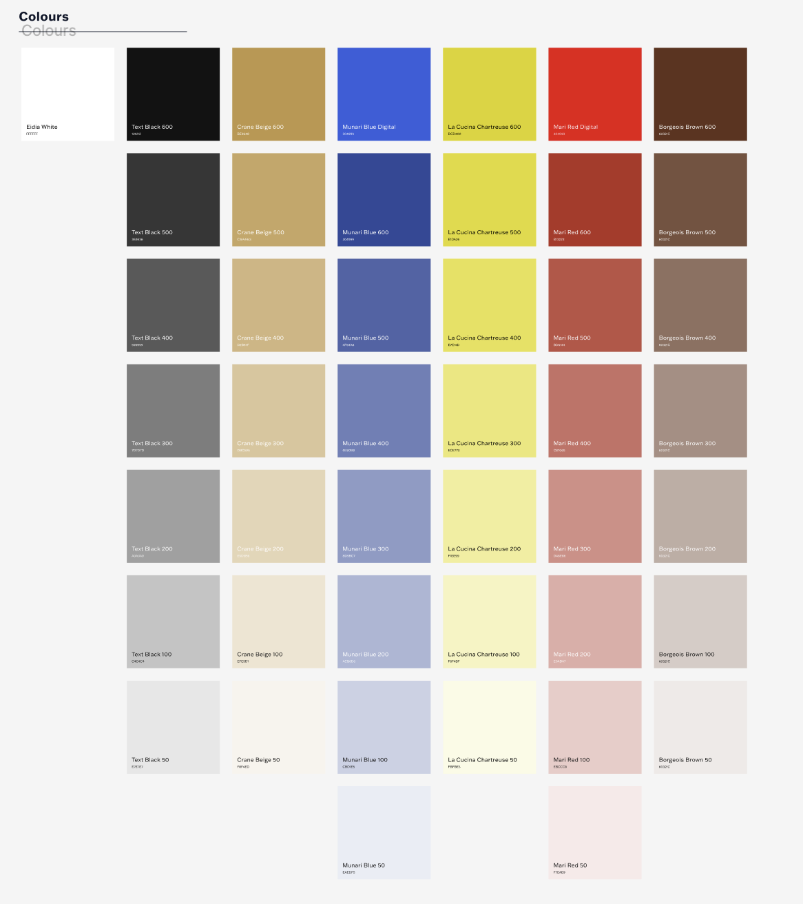
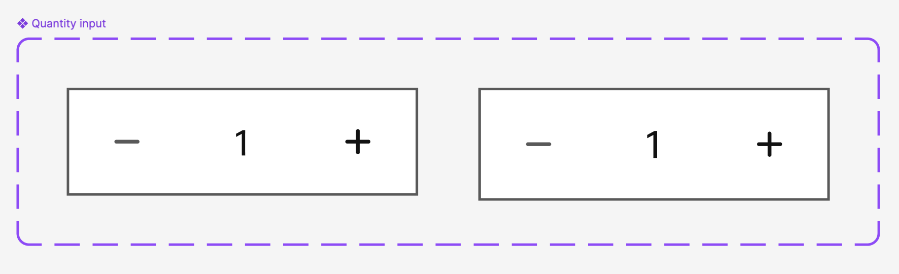
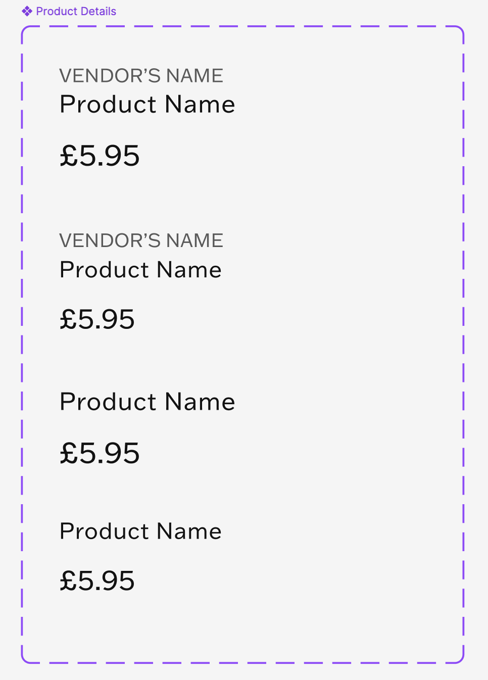
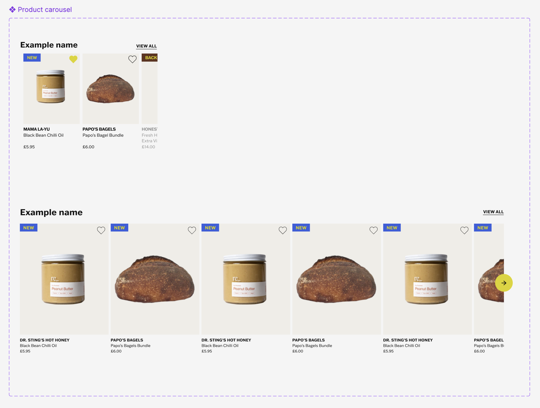
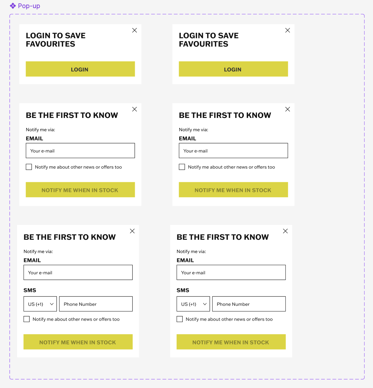
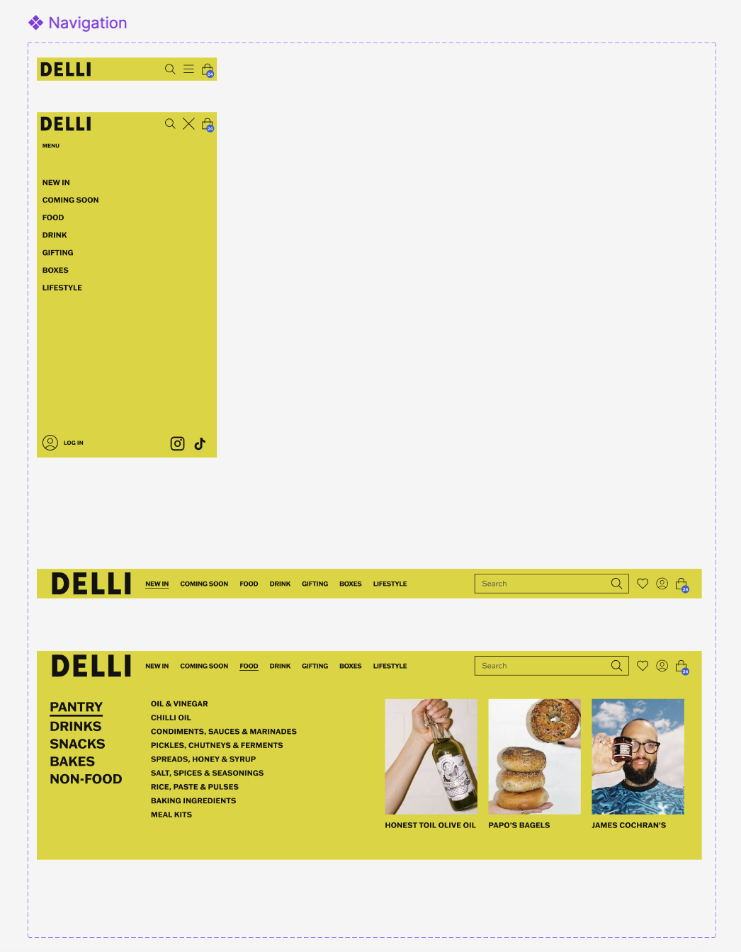
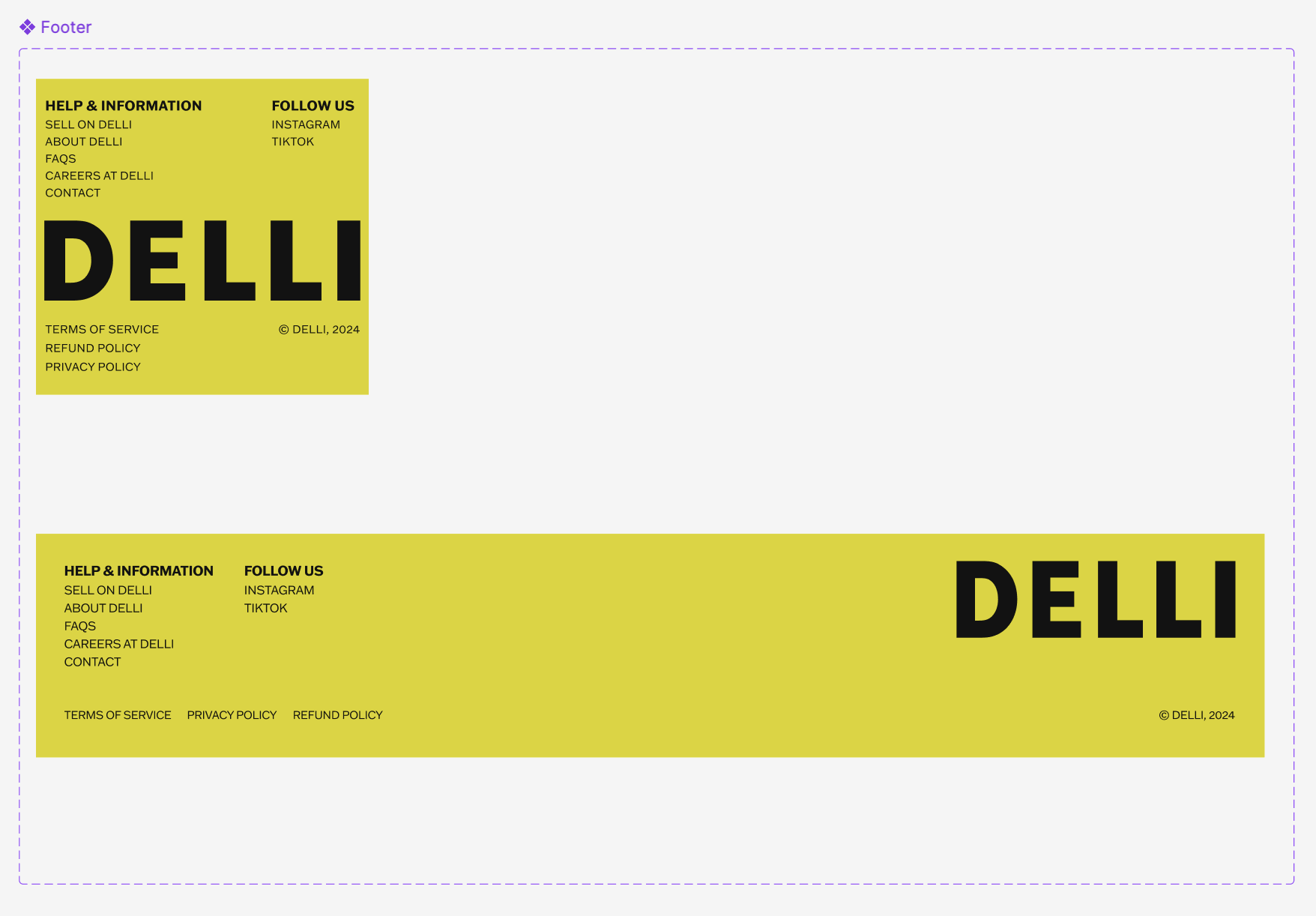
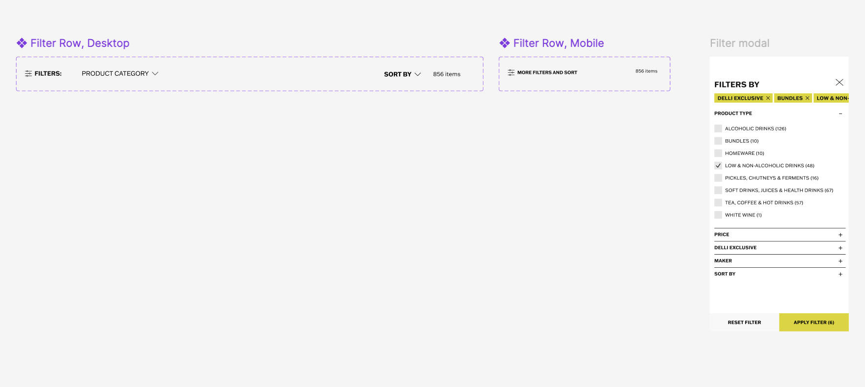
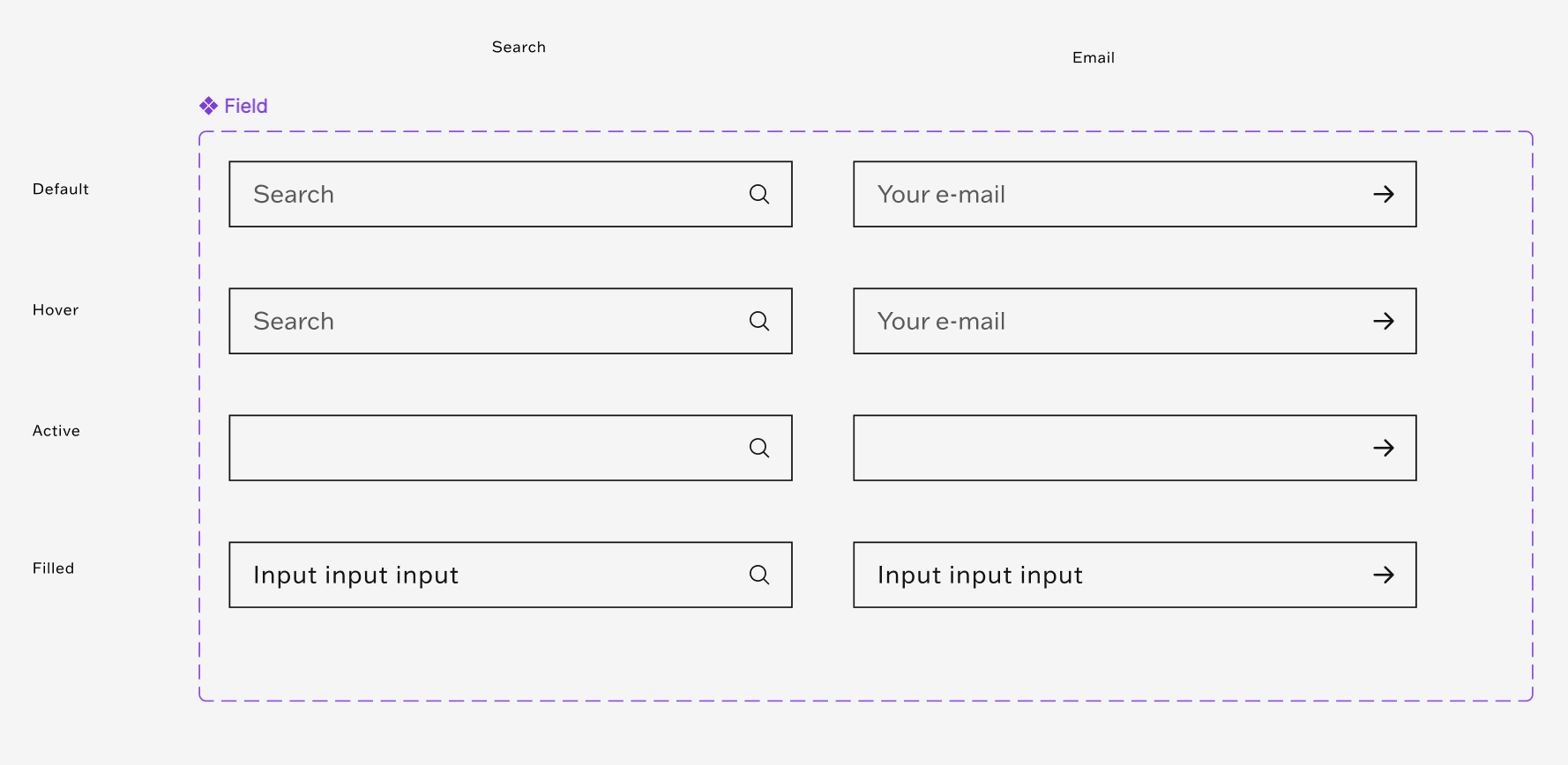
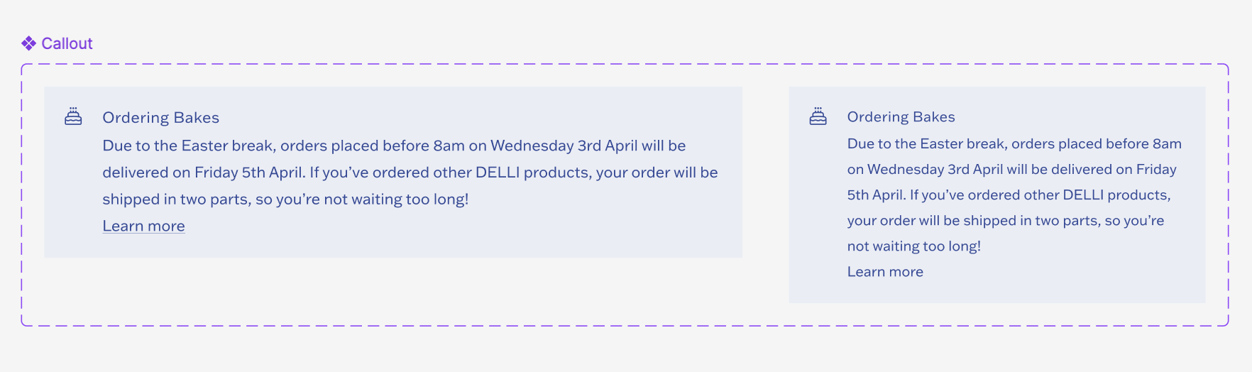
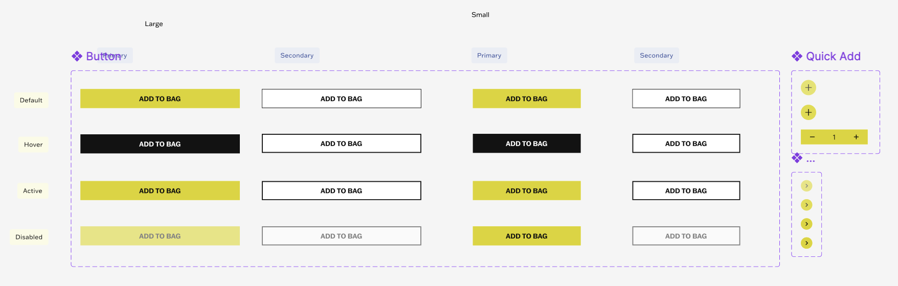
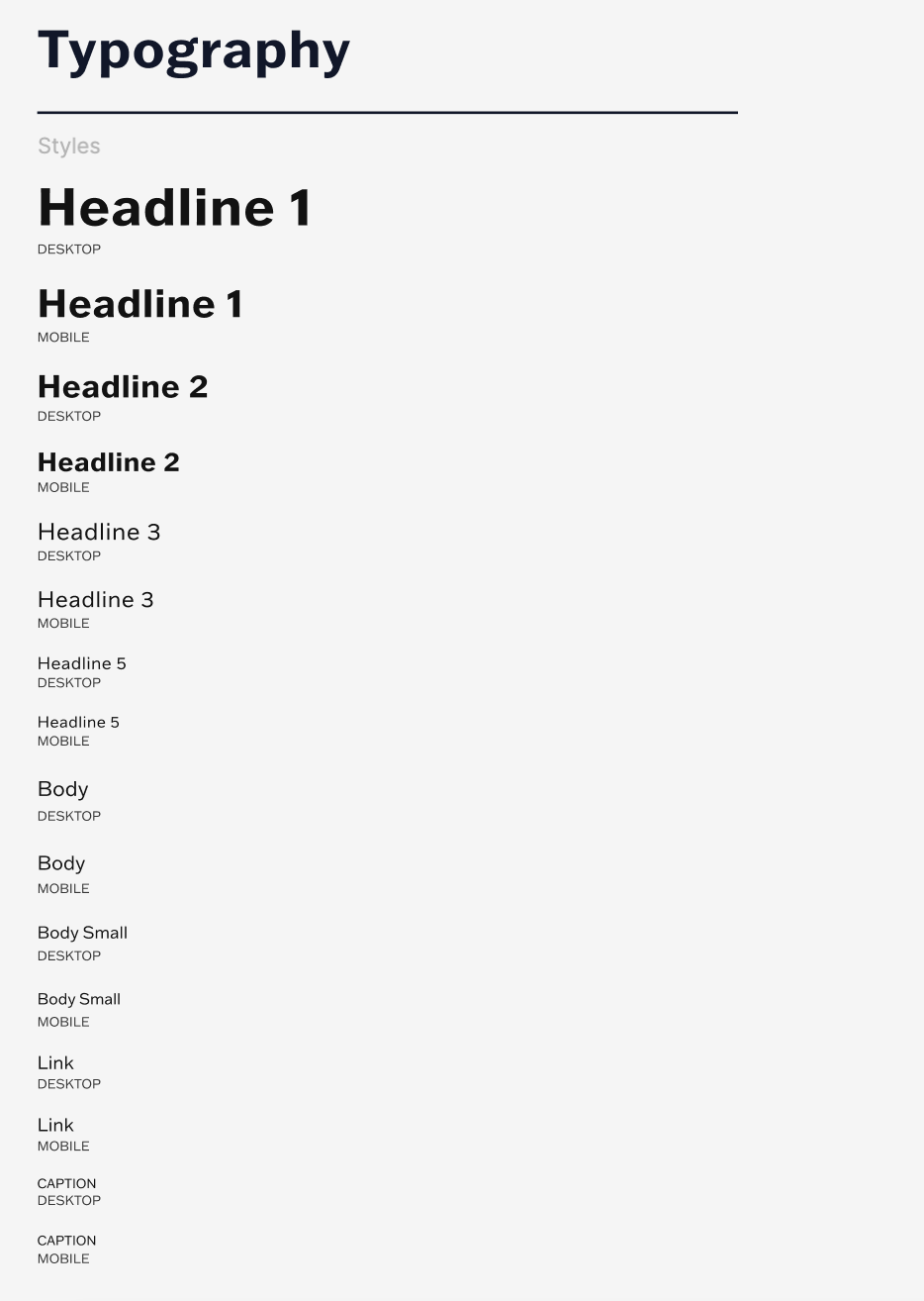
To increase efficiency and remedy growing inconsistencies in brand communications, I built the DELLI Design System from the ground up, transforming a fragmented ecosystem into a single source of truth. Approaching the project from a holistic point of view allowed me to conduct a comprehensive audit of our existing interfaces, showing hidden design issues and redundant elements. By identifying these gaps, I was able to streamline our visual vocabulary and design optimised, scalable variants of components that far better captured the unique look, feel, and energy of the DELLI brand.
In building the system, I actively tackled universal design system challenges. I established strict naming conventions and a foundational design token architecture for colours, typography, and spacing, ensuring alignment with the engineering team. I structured components using flexible Figma variants capable of handling edge cases while maintaining strict brand integrity.
Ultimately, this system bridged the gap between design and development, drastically reducing time for new features to be built and eliminating repetitive work. By establishing this shared framework, I not only elevated our visual craft but also empowered both teams to collaborate with speed, confidence, and consistency.
DELLI 1.5
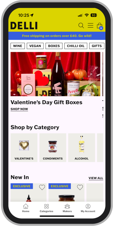
In preparation for the busy Christmas period, we needed to quickly optimise our online shop without making big risks during a critical business window. As a strategic short-term solution, I focused on executing high-impact, low-dev-effort changes directly within our existing Shopify theme to streamline the purchasing journey. The primary goal was to reduce conversion friction, optimise mobile discovery for festive shoppers, and surface relevant seasonal products more intuitively. This required a tight balancing act between making meaningful UX improvements and working within the structural constraints of the current theme, ensuring we maximised revenue potential.
The impact of these changes was pretty immediate and significant. Within just two months of the launch, website analytics revealed that both 'Pages per session' and 'Average session duration' had at least doubled. This dramatic surge in engagement proved that the optimisations successfully transformed a previously clunky browsing experience into a highly relevant, captivating user experience. By making it easier for customers to discover and transition between products, we kept users on the site for longer and we significantly increased their intent and interaction during DELLI’s busiest season of the year.

DELLI 2.0
Whilst we were happy with the increasing signs of user engagement with the website, the data on returning customers was largely unchanged. We wanted to explore how we can increase the returning customer figures.
Planning
I started this project working with the founder in trying to understand how he saw DELLI in the future and what aspirations he had for the website and app.
There was already a business objective to increase the number of returning customers, but through talking to the founder it became clear that he wanted DELLI to be a place where customers would come to in the same way they would to a social network; to browse, to explore, to learn.
In order to achieve this we decided that we would concentrate on the mobile app experience first. I felt like we needed to start building habits in the customers and doing that via a mobile app felt the best way to test this.


App Structure and Lo-Fi Wireframes
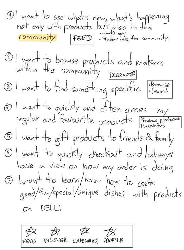
I began working on the structure of the app. For MVP we wanted to strip it back to the bare minimum needed to answer the key user needs we’d established.
First round of feedback and iterations
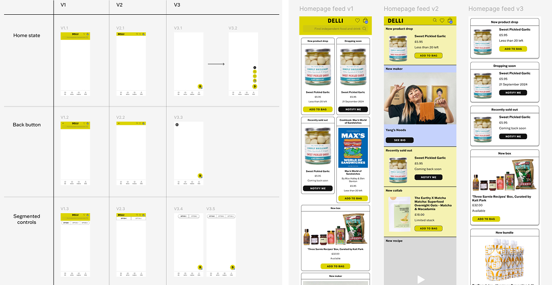
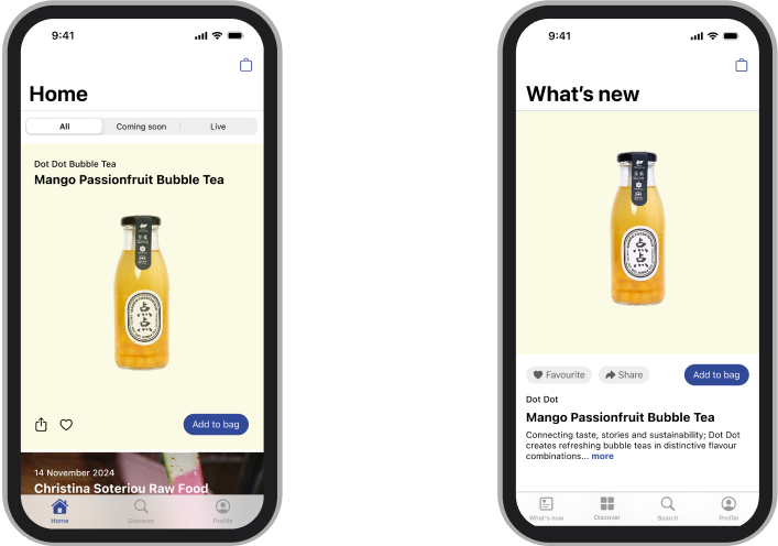
I shared these ideas with the founder and gathered his feedback. I then iterated on these designs based on this feedback and increased the level of fidelity. I also made the decision to use as many native elements as possible to ensure this app would be easily usable in both iOS and Android devices (DELLI app was previously only compatible with iOS devices).
User Testing Prep
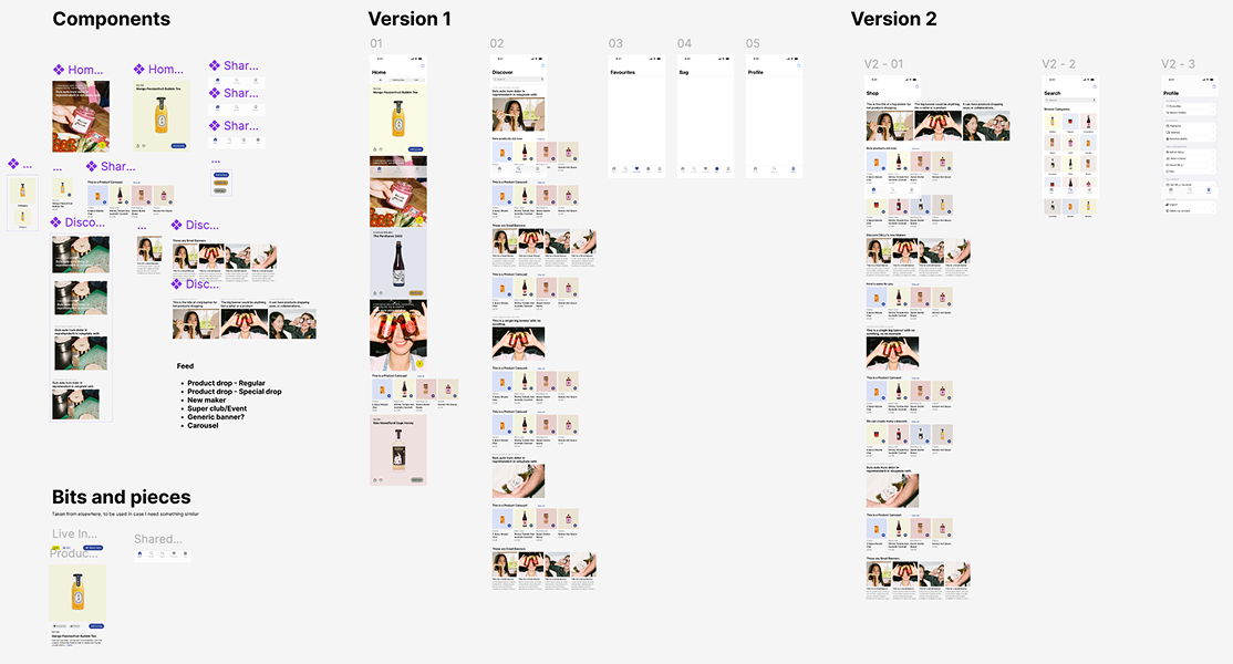
I created 2 prototypes to test with DELLI customers. There were some key differences between the prototypes that we were keen to test: the navigation, the feed and my profile.
Testing Round 1
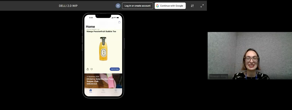
Once I had created 2 different prototypes of the app I ran the first round of user testing interviews with DELLI customers. I interviewed 6 participants over 2 days, with the first section of the interview being about understanding the customer and their user needs and pain points, and the second section was used for testing the prototypes. I ran the tests by asking the user to attempt certain tasks and collecting their feedback as they went along.
User testing feedback and iterations
User the feedback and findings from the first round I made some changes to the two prototypes. These included wording changes in the navigation, aesthetic tweaks to the feed as well as some changes to the script.

Testing round 2
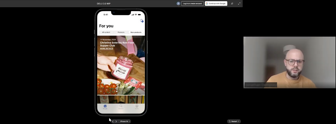
I ran a second round of user testing with six participants in one day, using updated prototypes and a similar format to round one, with slight tweaks to the initial questions and revised flows in the second section.
Testing results
Once the second round of user testing had finished I put together a deck with the findings and proposed next steps based on the results.
