Pivoting from B2B to B2C
Shifting an existing B2B finance experience into the consumer market
Highlights:
Component library established
Successful launch on Interactive Brokers Marketplace
Used by over 1,000 customers in first year
Increased annual revenue by more than $60,000
Mobile app developed for on-the-go users
Brief
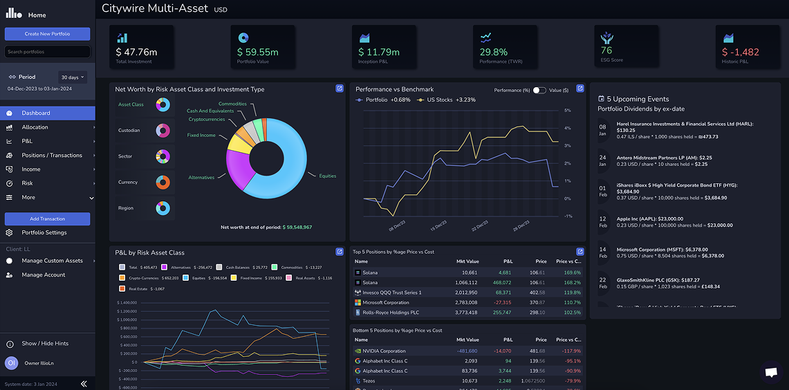
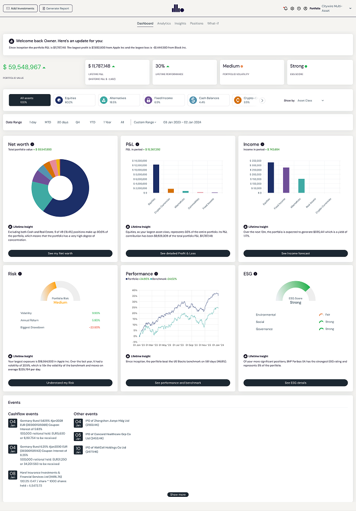
My first task when I joined was to start making the app more suitable for a B2C audience. We had around 15 B2B customers using our original p&l app (illio blue), but this app wasn’t suitable for a B2C audience (see below).
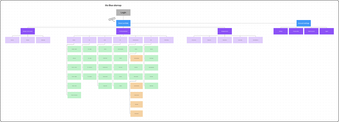
New information architecture
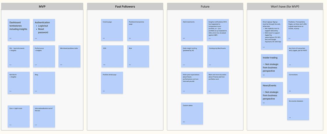
The first thing I worked on was refining the structure of the illio blue app as I had already discovered some issues with it’s architecture. I worked very closely with our co-founders to establish a new architecture that we would use in the new (illio white) app, as well as making decisions on which features or pages we wouldn’t include in the migration over.
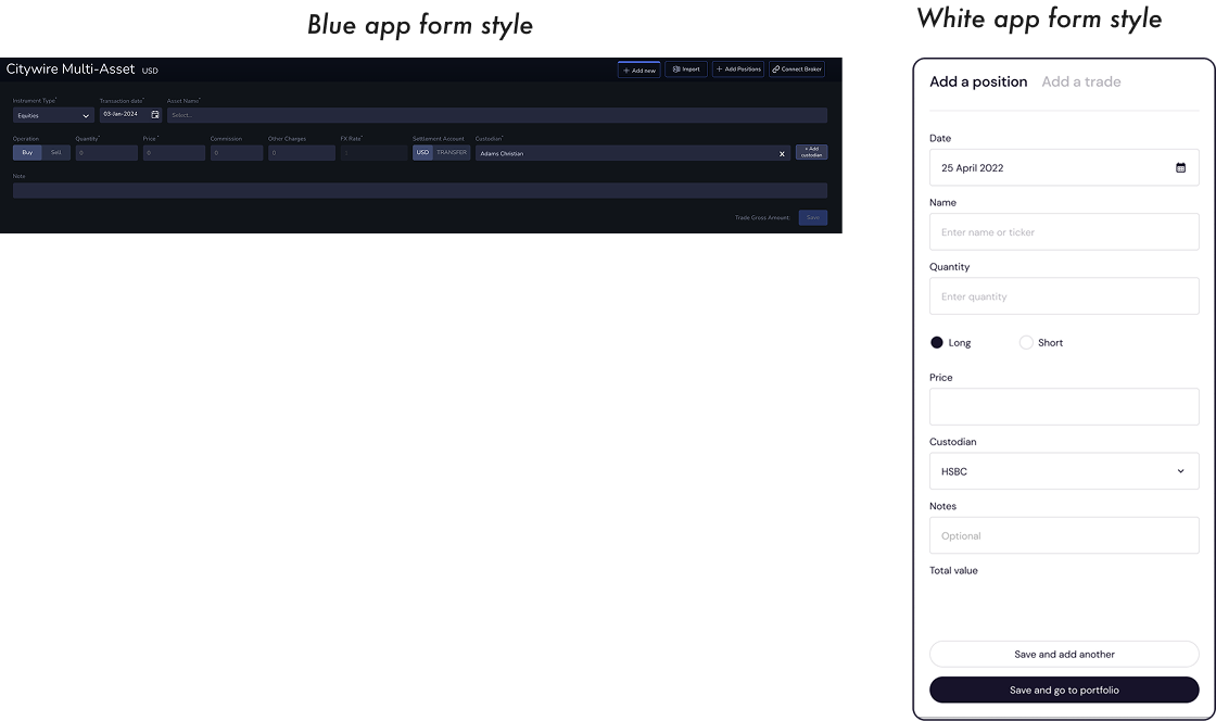
Creating a new component library
Once we had established what was to be migrated, I began working on how each of these screens would look. One of the biggest changes was moving from a horizontal form style in the blue app to a more consumer-friendly vertical form style. Another big change was moving from a left-hand vertical primary navigation to a more consolidated horizontal top navigation.
Getting the designs built
Like most startups with an in-house dev team, we worked in an agile way, meaning my designs were often being built quickly (sometimes I was designing screens in tandem with the developer building them). This allowed us to build the new white app fairly quickly but we suffered from being unable to do adequate UAT in parallel as we didn’t have the right resources to do this.

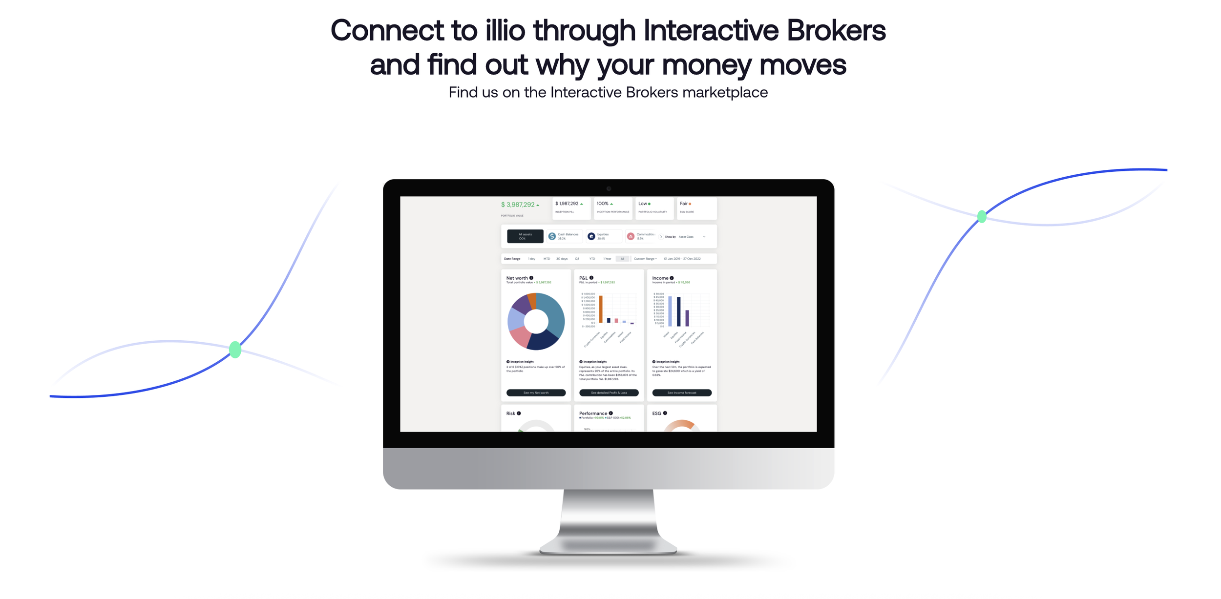
Launching on Interactive Brokers
Once we had the illio white app ready we launched our new app via the Interactive Brokers marketplace. This came with a new set of problems (both engineering and UX ones) and we finally launched in February 2023.

Post-launch results
In the first 3 months post-launch we had nearly 500 new customers through Interactive Brokers. This continued to grow and we had accumulated over 1,000 customers through Interactive Brokers in the first year since release, providing steady revenue for the business.
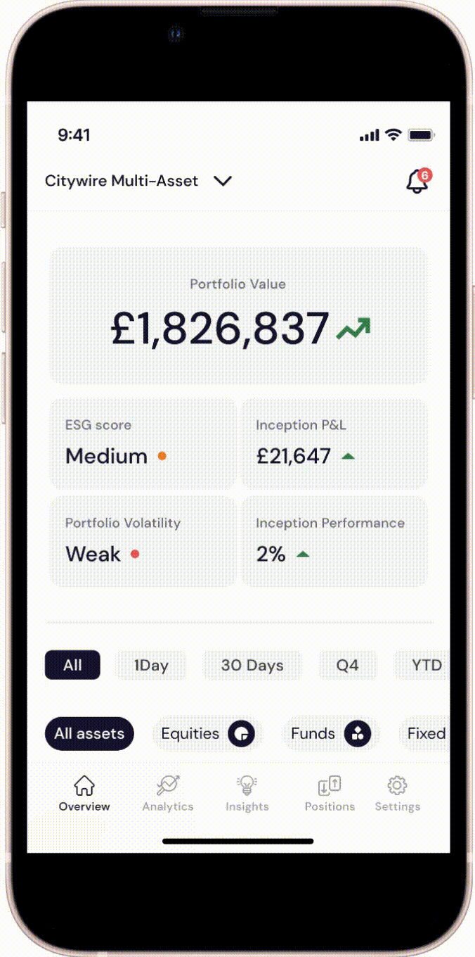
Mobile app planning
I proposed to our founder that in order to provide our customers with a more complete experience of illio, they needed something more suitable to access their portfolio information on-the-go. I conducted a workshop with our co-founders and some developers to ascertain which features of our desktop app we would need to provide our customers with on a mobile app.
Wireframing the MVP screens
Once I had an idea of which features we would include in the mobile app I began some lo-fi wireframes of each screen, with a view to create a quick prototype that the co-founders could interact with to ensure they were happy with the chosen screens for MVP.

Creating the high-fidelity prototype
After some small changes to the MVP scope, I began designing the high-fidelity screens and preparing the designs for build.

Building the app
The first phase of the app was built a few weeks after the designs had been finalised. After 30 days of launch on the app store nearly 30% of existing illio customers had downloaded the app.